E-commerce Checkout Process Enhancement
A better purchase journey that helped to reach 233% GMS growth
Company
Rakuten Taiwan introduces the unique B2B2C e-commerce business model to local market.
Team
UX team, Front-end Dev Team, PM, Business Department
Responsibility
I was a senior UX designer, redesign the checkout process base on tracking data analysis and user research reports from researcher. I also provided suggestions on project planning to further fulfill the requirements from Business Department and user needs.
Problem Statement
Shoppers keep products in the cart rather than place order. How to enhance checkout process becomes the major topic in Business Department's mind.
Objective
As Rakuten Taiwan's core business is e-commerce, the goal for this project was increasing GMS and conversion rate by improving checkout process.
Performance Results of Checkout Section Enhancement
GMS grows 233% ⬆︎
Number of campaigns increase 152% ⬆︎ (Campaign created by merchants)
(Nov. 2020 vs. Oct. 2020)
Understand Shoppers' Journey: Dive into quantitative data
To find out what have shoppers been through during their checkout journeys, I used analytics tools to understand shoppers' flow and created the context overview mapping of checkout process. These analysis findings were further cooperated with user reports from researcher.
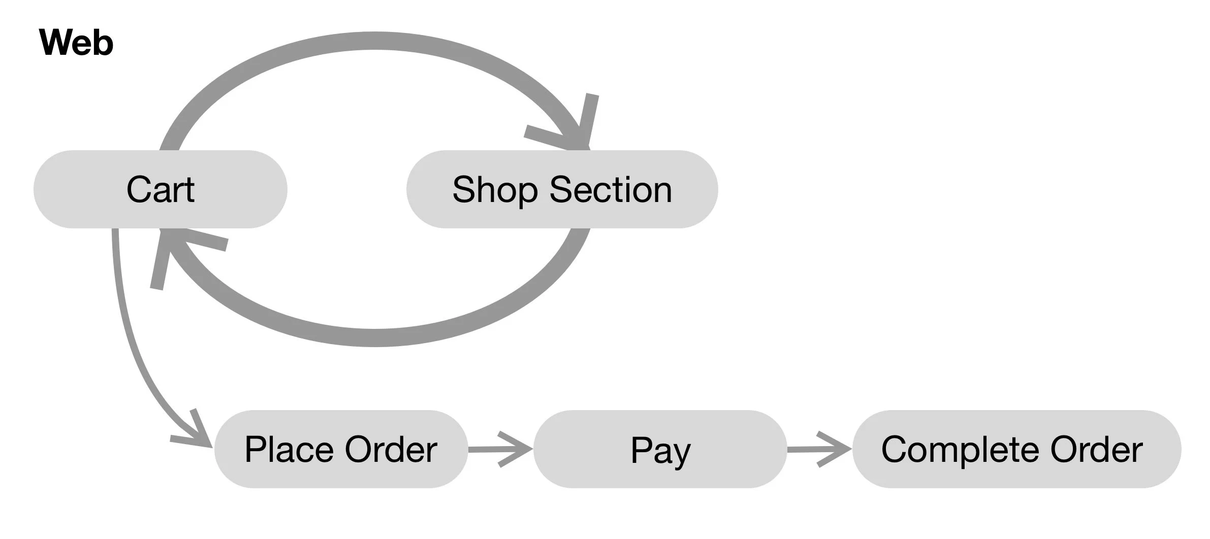
Website shopper purchase behavior:
Incentive circulation on website: shoppers filling cart from same shop.
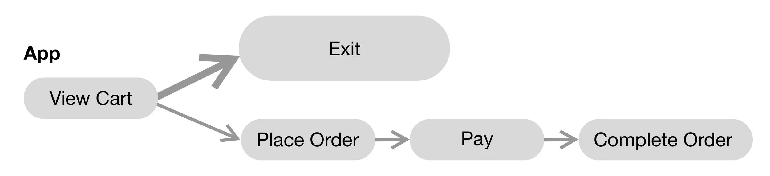
App shopper purchase behavior:
Goal orientation flow on the app: focusing on checkout process while they might finish search and peak process on the device with bigger screen.
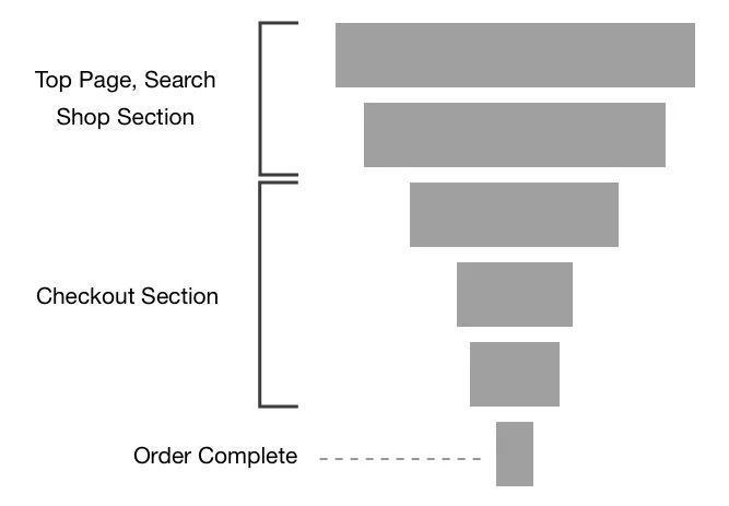
Bottom up purchase journey
Since Checkout process is the funnel end of shopping journey, enhance checkout process means enhance from the funnel top - shop section.
How Might We Provide a Better Purchase Journey?
The qualitative data from user reports and quantitative data from analysis result, these data were consolidated into the fact and behavior insights of shoppers’ behavior. With these picture in mind, I used HMW question as initiation for further product planning. The direction for purchase journey enhancement with overview of product came in three aspects:
Enhance experience of Product Page - start point of purchase journey and trigger user to add product to shopping cart.
Enhance Shop section - data analytics reveals shoppers behavior of entering shop for more purchase to reach the order price for free shipping.
Simplify information over checkout process and assisting a better choice for purchase.
Since the project direction focused on Checkout process this time, there were two challenges came along with the requirements from business department.
Challenge for Design Projects
Challenge One
As adding top AD banner was the requirement from business side but the top AD might distract users from the checkout page. Navigating the balance between business demands and user experience, I recommended featuring payment method-related promotions as an enticing addition to the checkout page, addressing both objectives effectively.
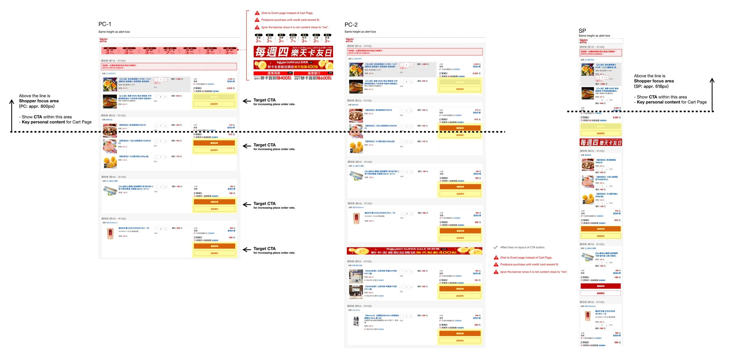
An evaluation of potential affect for top AD banner Challenge Two
Business department planed to add new combinations to existing campaign rules that confused our users already. Balancing the business goal of boosting GMS, I seized the opportunity to enhance the checkout experience. I not only aligned with the business requirement but also offered strategic input for project planning, optimizing the information display during checkout process and mitigating user confusion effectively.
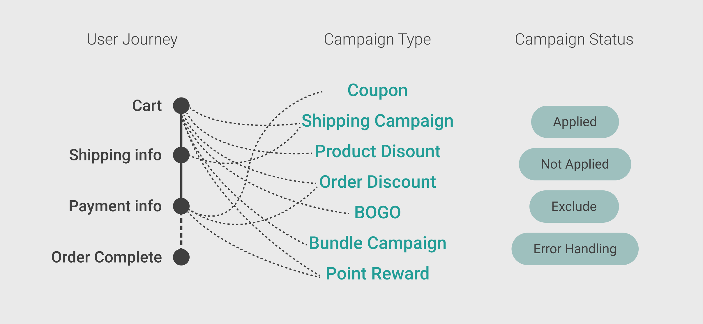
An overview of complex campaign rules that made shoppers confused and mapping to user journey stepsDesign Enhancement for a Better Purchase Journey
While challenge two required design effort, product and business departments came to consensus on enhancing checkout process to meet the business goal and solve existing user painpoints. The new design of shopping Cart page and Delivery page helped users to check product info, campaign info and summary of each cart in easier manner, reducing the overwhelming information during the original checkout process.
User Insights and Painpoints
Base on the user painpoints from existing research report, I analysed the production UI to find out the reason that caused users confused:
The overwhelming info to check on shopping cart and delivery page
For shopping cart, users focus on four types of information before they decide to place order:
Product info (product name, quantity, price)
Discount info (campaign applied, shipping discount, coupons)
Extra fee (delivery fee)
Member point reward info
How to organize the info within shopping cart and delivery page became the primary task for design solution.
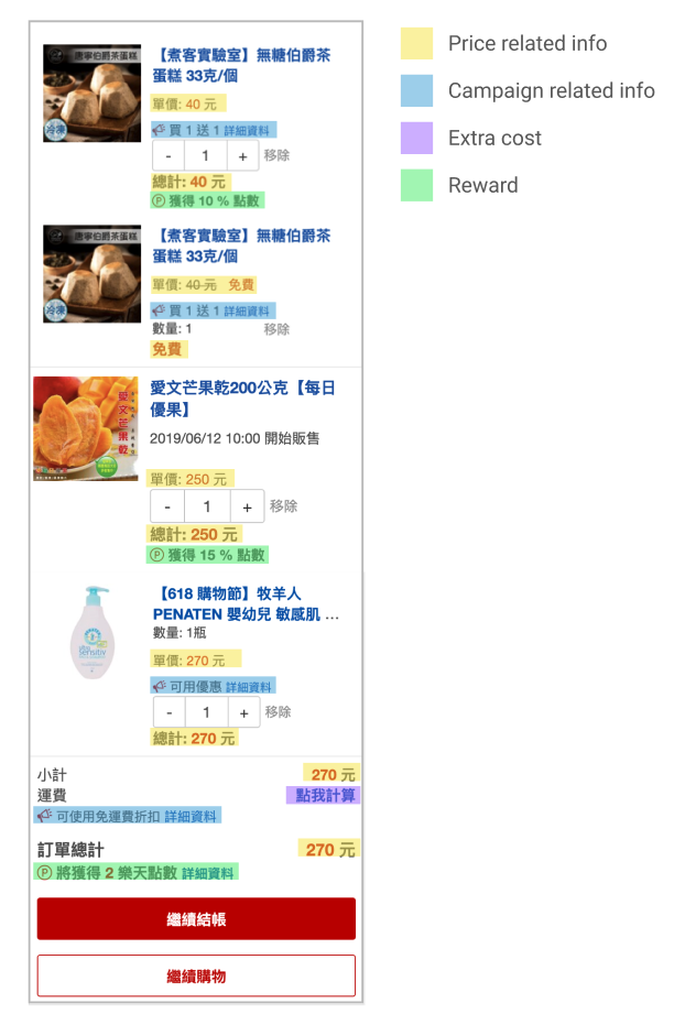
An analysis for information type that reveal the overwhelming info on Cart pageDesign Solution:
Make the final decision for placing order easier
Following the analysis of existing layout and information display on product cards, I illustrated the wireframe for variants of campaign types and status into more synthesis manner. And I created campaign label to solve the user painpoint that hard to scan and identify campaign types on multiple products for a better deal.
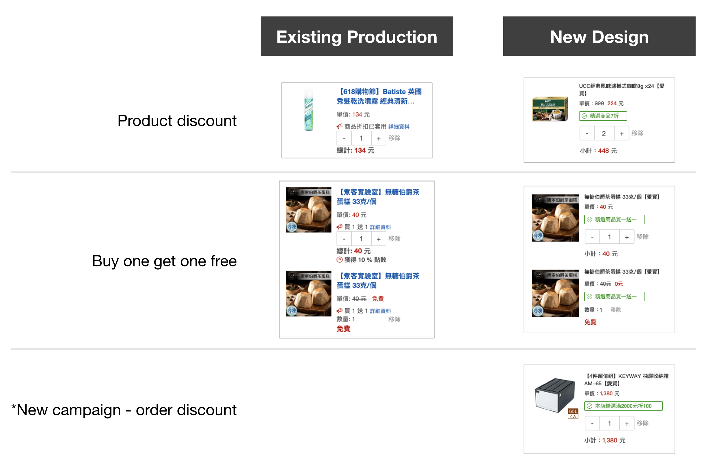
Wireframe of new product card design and comparison of existing product card and new design with distinct campaign labels Design Enhancement One:
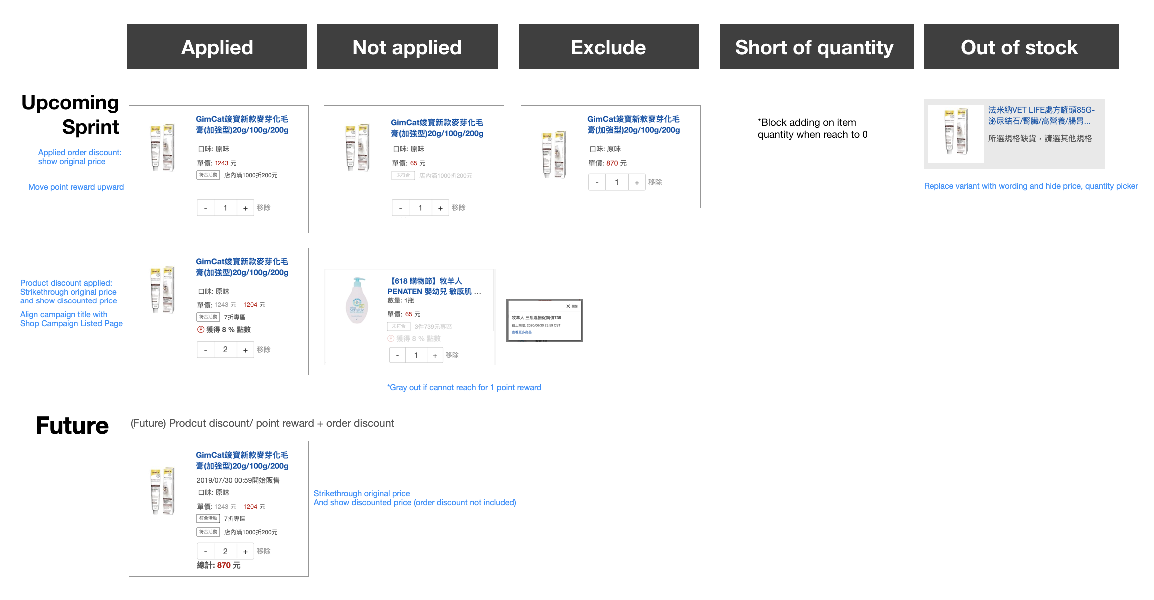
Used campaign label to indicate the campaign info for product. Helped users to check applied campaign easier and make users aware of more campaign options to trigger more purchase.
Campaign label also worked as enter point to campaign content. The campaign content explain what campaign offer and expose more product to users.

Use campaign label to encourage users for more purchase with campaign options Design Enhancement Two:
For shopping cart summary: summarize total discount and campaign applied to users and reduce the effort for calculating total discount manually.
For delivery summary: indicate applied campaign and shipping campaign to help users checking on campaign info.

Redesign of cart summary Design Enhancement Three:
Ease the work load of confirming with better organized info layout of shopping cart page.
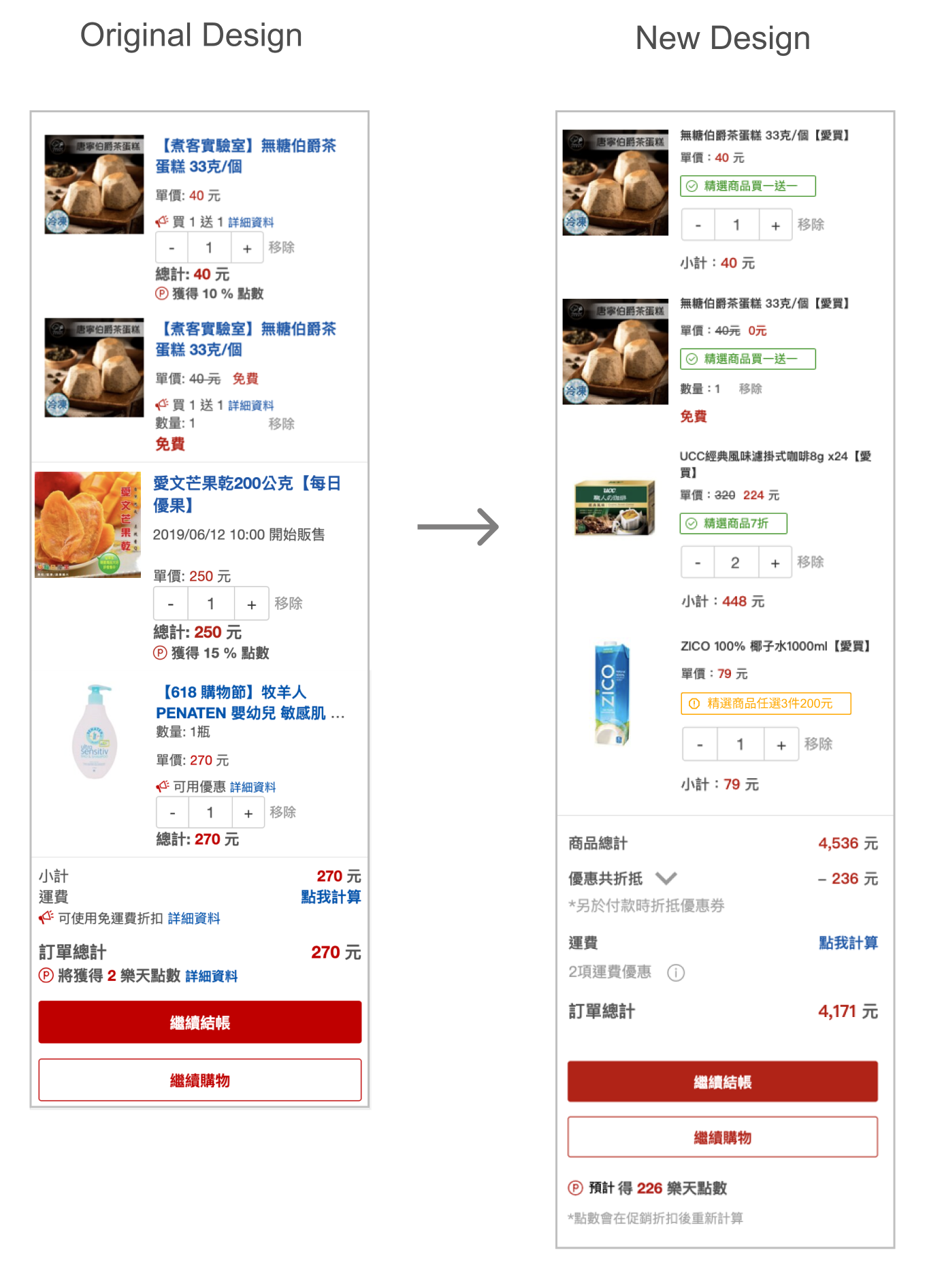
Redesign of shopping cart page 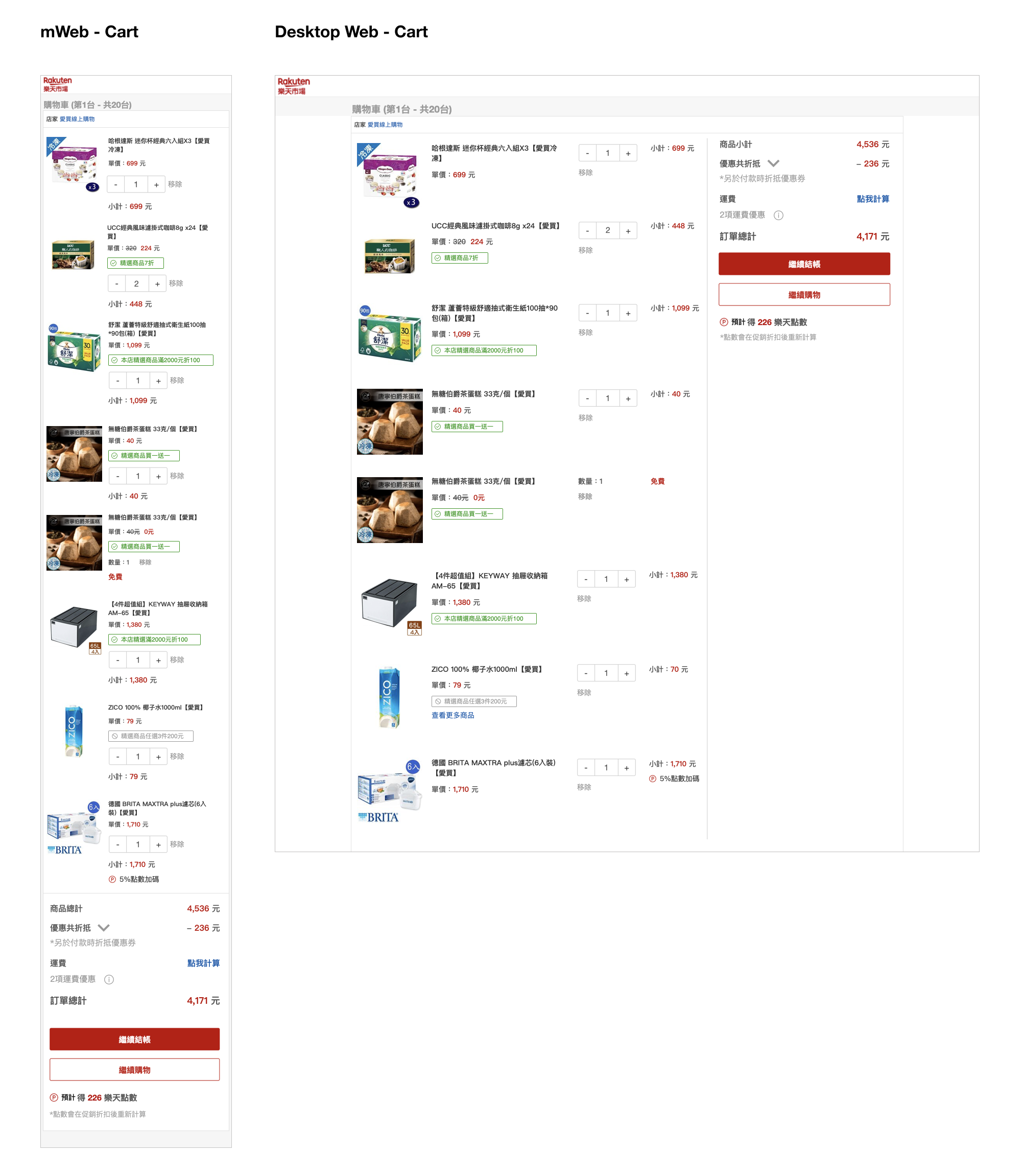
Wireframe of responsive design for mobile to desktop web Explore Original and New Design on Prototype
These two prototype were created as a comparison of original and new design. Added annotations of how I analysed and rearranged the information on product cards for Cart page.
Original Cart Page
Scroll to explore
Tap to view analysis demo
New Cart Page Design
Scroll to explore
Tap 'discount label' or 'shipping campaign info'
Interested about this project?