Search Enhancement for E-commerce Website
Elevate search experience for e-commerce shoppers
Company
Rakuten Taiwan introduces the unique B2B2C e-commerce business model to local market.
Team
UX team, Front-end Dev Team, PM, Business Department, Search Logic Data Team
Responsibility
I was a senior UX designer, conducting the user research, usability testing and redesign the Search page base on users needs and requirements from Business Department. I also shared the insights from research to cross-functional teams and helped the teams to plan the enhancement in users feet.
Problem Statement
As an online shopper, I need the search function that easy to add filter and the results are easy for picking the ideal product with deal.
As a designer, I need to know the painpoint and gap of using our on-site search and product picking process.
Objective
Elevating the online shopping experience starts with the first step of product search. This project tackles the challenges of declining user engagement and conversion rates on the E-commerce platform's search page, aiming to enhance both usability and the overall design of the legacy search web page.
Bottleneck
While traffic of visit and product order raise, however, the conversion rate didn't catch up with the growth. Which indicated that shoppers couldn't browse and found out matched products through on-site search.
Performance Results of New Search Design
Desktop website search page:
RSR increase 12% ⬆︎
Bounce rate slightly decrease 0.06% ⬇︎
while visit decrease 11% & entries decrease 0.6%
Mobile website search page:
Enter shop section increase 1% ⬆︎
Bounce rate decrease 2% ⬇︎
while visit increase 1% & entries increase 13%
Start from User Insights: Shoppers’ Exploration
At the start of the project we had some requirements for the new search feature. Without pre-exist user behavior data, I interviewed 12 existing shoppers to understand how they explore search on the platform.
Painpoint 1: distract From Efficient Products Scanning
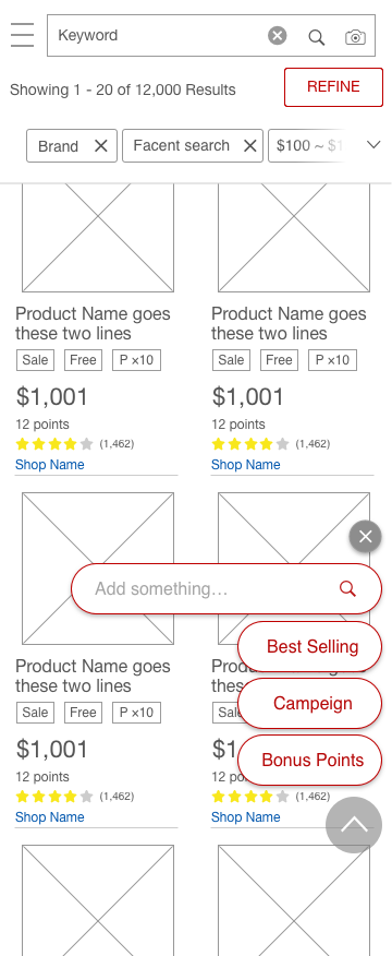
Users were less concentrate on scanning product list and checking if results relevant to their searching. Variety color for product information, font size and image size made users harder for efficient scanning.
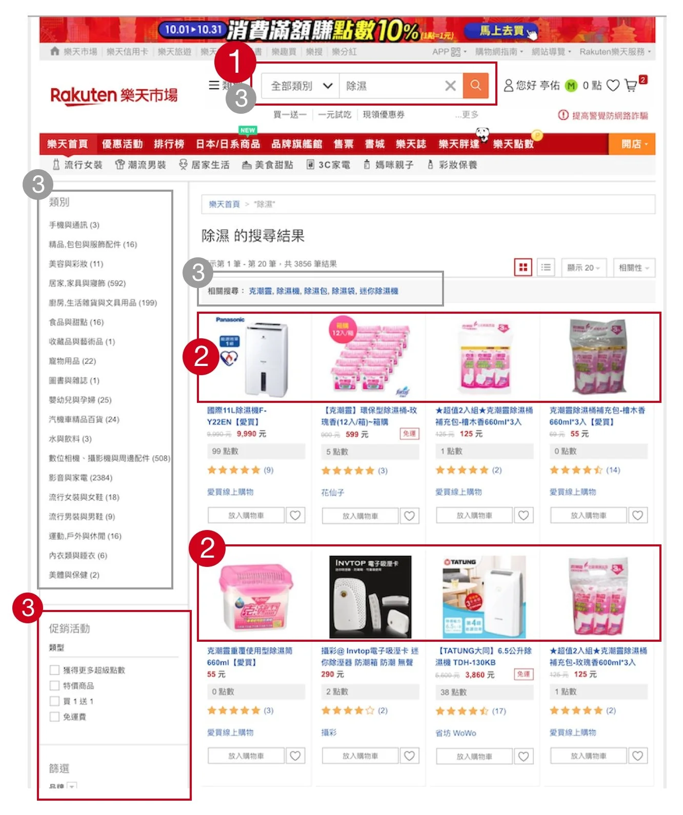
Users scanned through the search result page with focus priority as indications marked on the imagePainpoint 2: Out of Focus from Product Information
Hard to scan through long product title and check if results matched. Product title in long description made shoppers confused about what the actual product was.
User Behavior: Trustworthy Brings Repurchase
When comparing product items in search results, shoppers were more likely to choose those from their trusted shops or items with higher reviews.
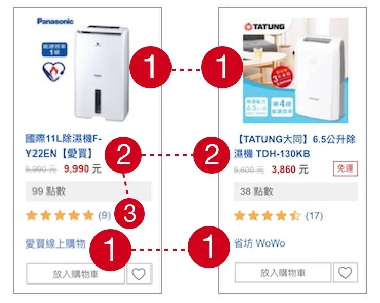
The indications show how users scan through product cards while scanning for the target productIdentifying Types of User Behavior
Type one: recreation searching
This type of users require for variety of choices and on trend recommends at a glance.
Type two: goal-oriented search
This type of users are keen to search for result that match to their inquiry.
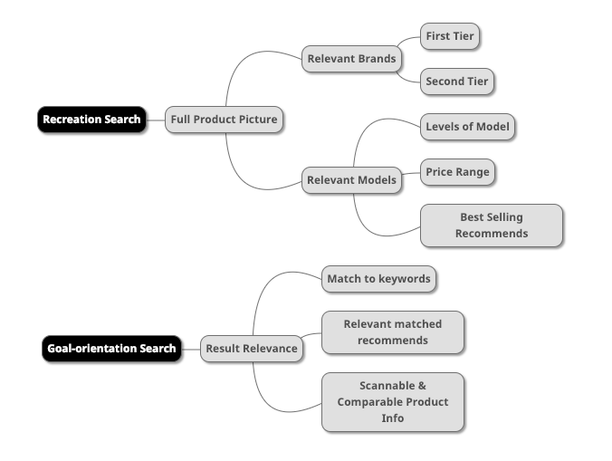
Two types of e-commerce shoppers search behavior on websiteUncover Opportunities on Customer Journey
To uncover untapped possibilities for elevating the search page experience, I synthesized insights gathered from user journey and user types. The synthesis consolidated in the creation of a comprehensive customer journey map, providing an overview of the purchase journey at each stage and unveiling prospects for enhancement.
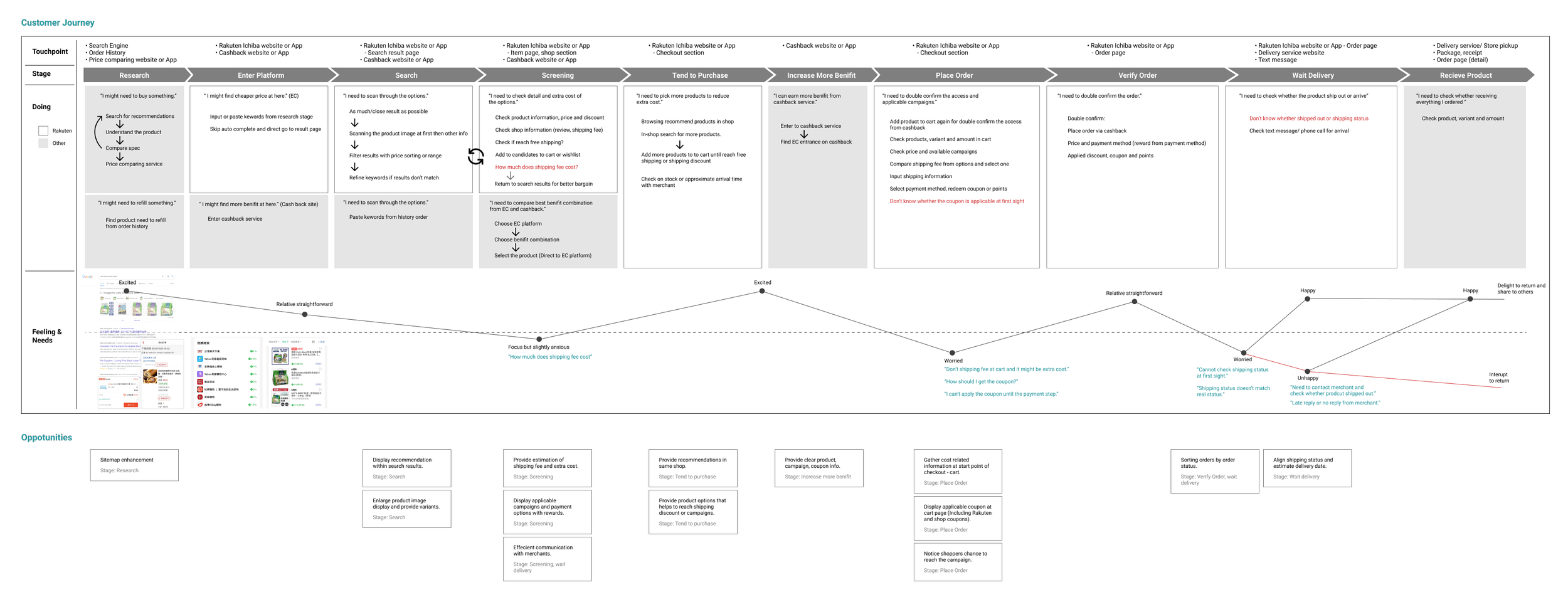
The customer journey map of Rakuten Taiwan E-commerce shoppers Redesign for New Search Logic
Base on the user insights and accompany with business requirements, I started to work on wireframe and flow.
Transform legacy to responsive web design
Revamping the Search page from legacy to responsive web was a pivotal goal. I crafted design deliverables tailored to breakpoints, ensuring a seamless transition to the new responsive design.

An overview of design deliverable for the responsive search page designCategory Restructure with Logic Data Team
Beside the page redesign, the category structure couldn't fulfill needs from merchants, consumers and marketing strategy for searching products. The challenges for UX design were:
How to display new category within new search filter structure?
How to indicate data retrieve status if necessary?
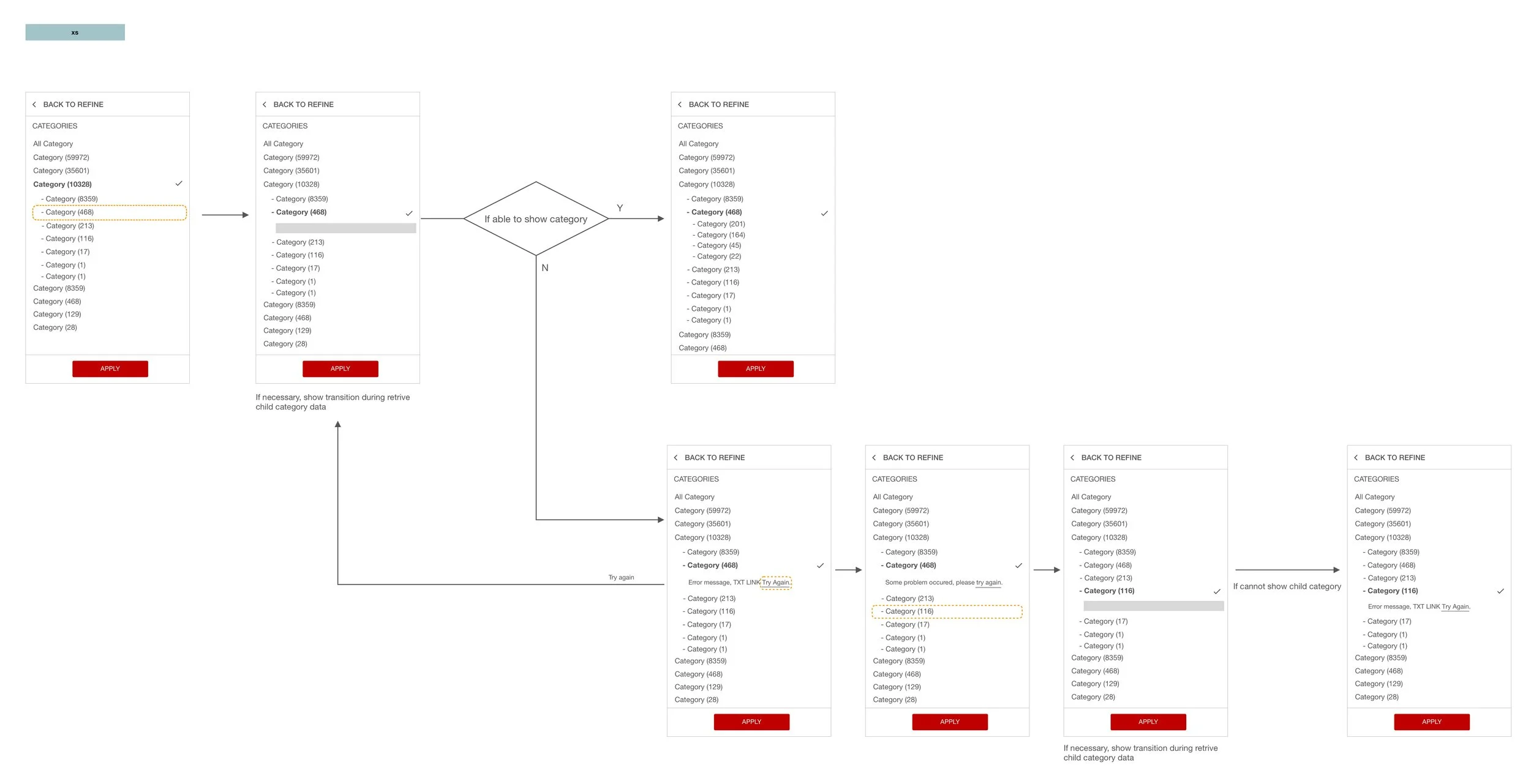
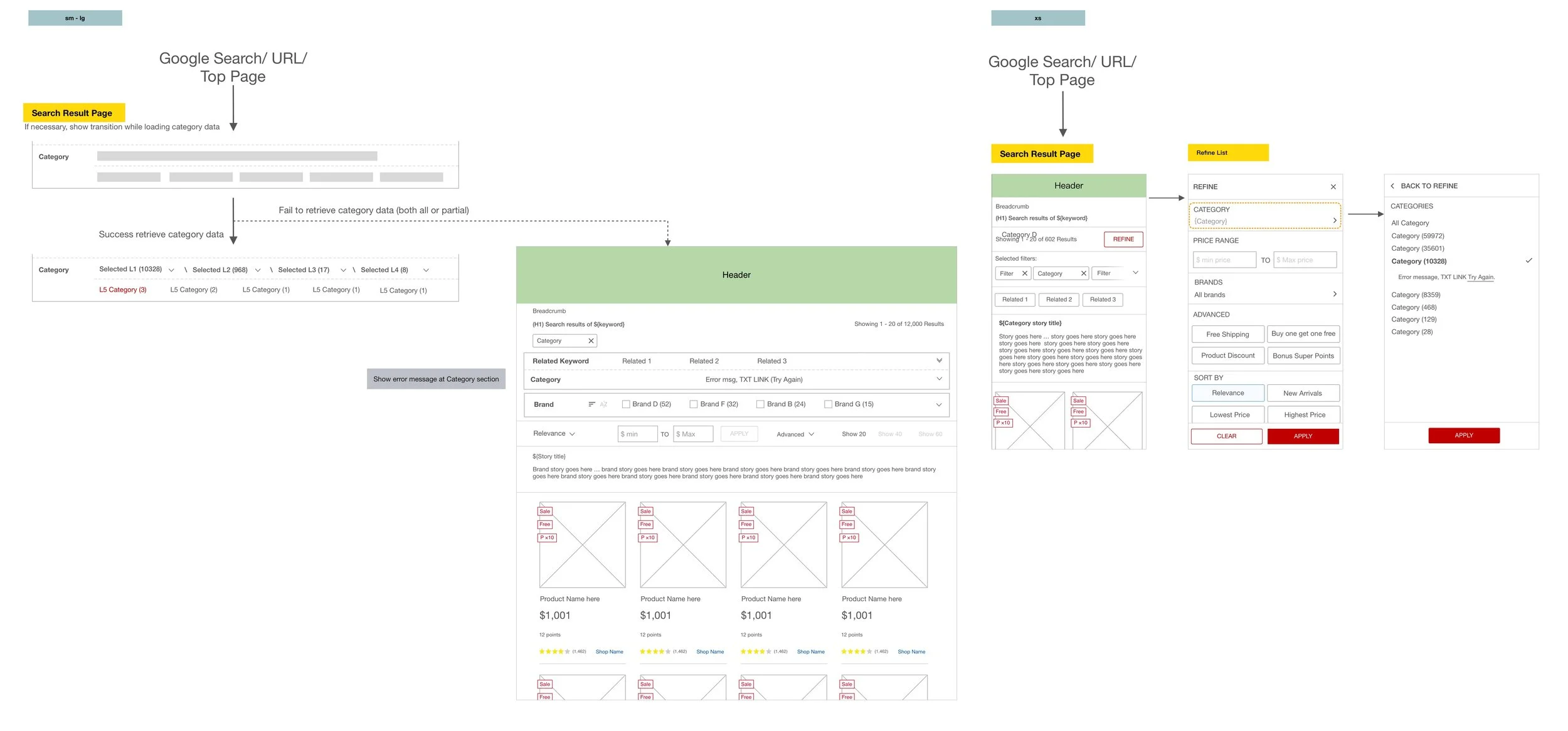
The wireframe and flow show the new category structure and interaction base on the responsive layoutAdvanced search filters at hand on mobile device
Variety of search results brings recreation search type shoppers dive into exploring. With Advanced filters near their side and take shoppers one step closer to purchase.
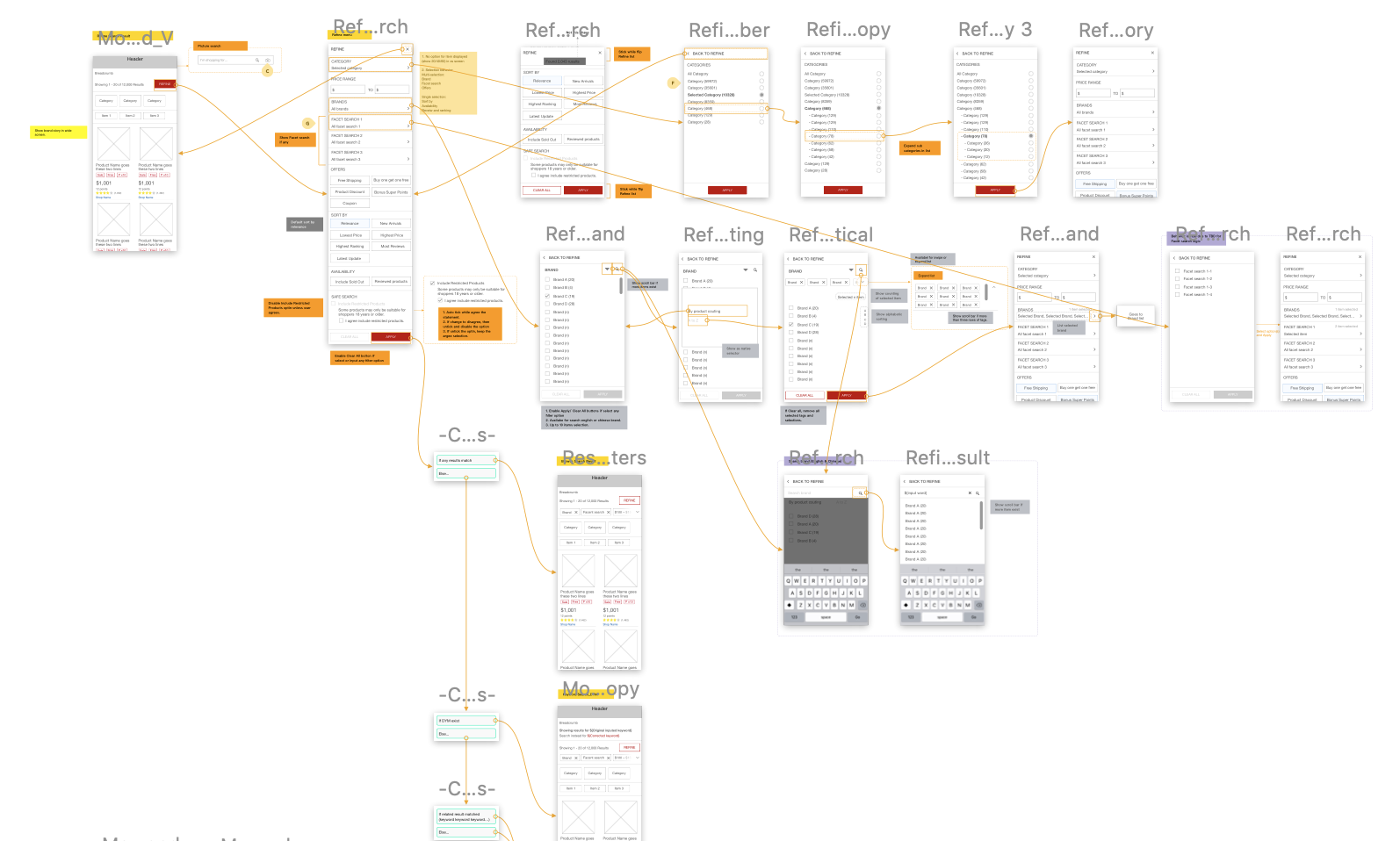
The wireframe and flow of advanced search function on mobile device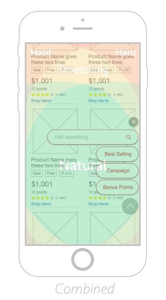
A shortcut design for advanced search and mapping of thumb zone for right and left handed usersPrototype & User Testing
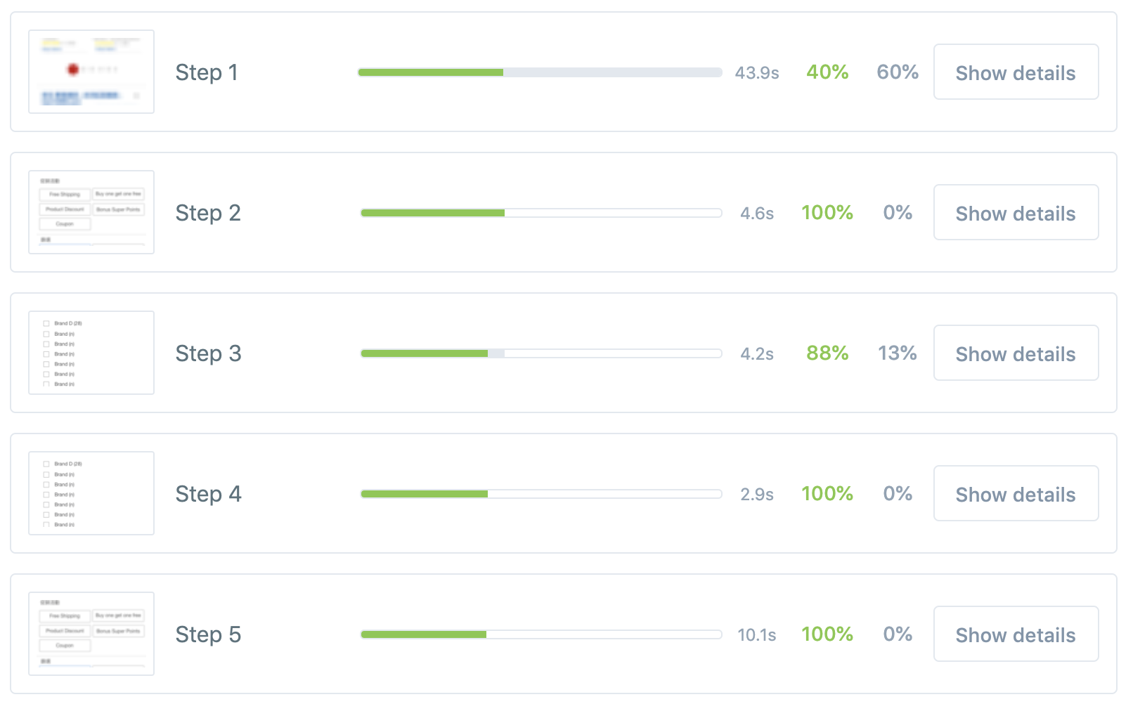
Following the validation of wireframe, I built the prototype for user testing. Through a 20-user test, I gathered valuable insights, including a comparative analysis between the existing production and the redesign.
Prototype Flow Analysis
Collect data for complete rate, time consuming between current product and new design.
Understand which step blocked shoppers from task completion.
Prototype Heatmap Analysis
Track how shoppers use and complete given search tasks.
Validate the effectiveness of the new design in assisting shoppers with their searches.
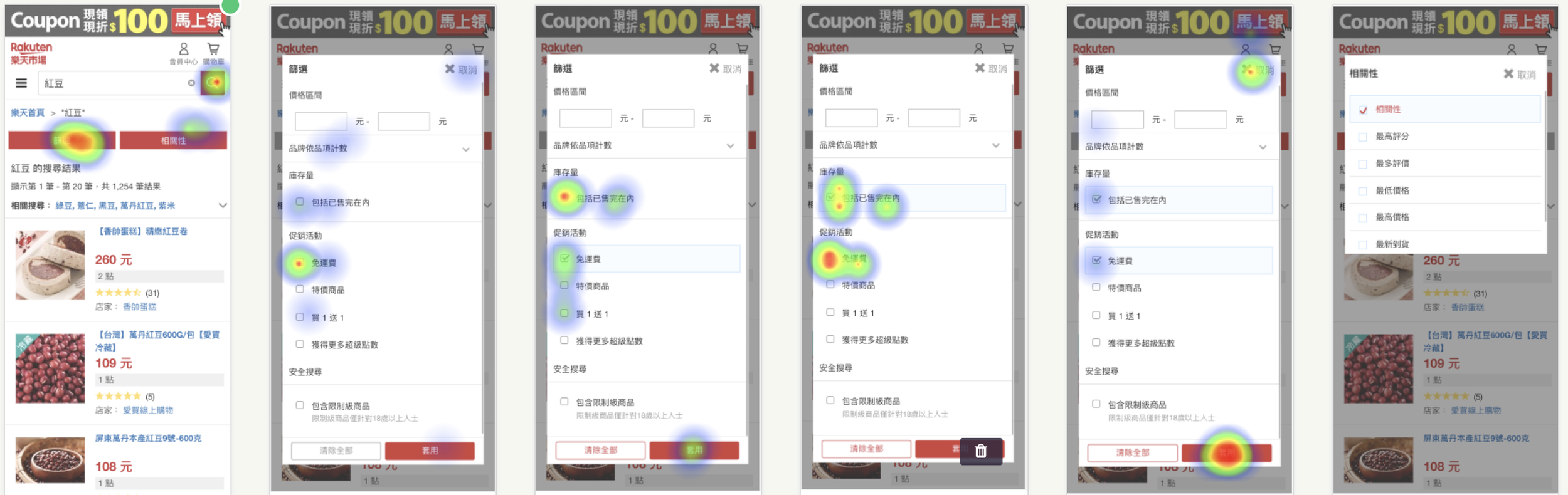
Heatmap result of original production search flow
Heatmap result of new design search flowInsights from Prototype Testing
Gathered insights from prototype testing, pinpointing usability challenges and user feedback to inform actionable improvements for the upcoming design iteration.
Desktop web:
Users can choose from search category and filter with the area of above fold in new layout which solved the paipoint on existing desktop production website.
The efficiency of new category layout and structure are similar to the existing structure.
Mobile web:
Eliminate the painpoint on existing mobile search filter, reducing the burden of choice on trigger buttons.
Improvement on UX copy:
The testing results indicated that there is a need for UX copy improvement within the search filter.
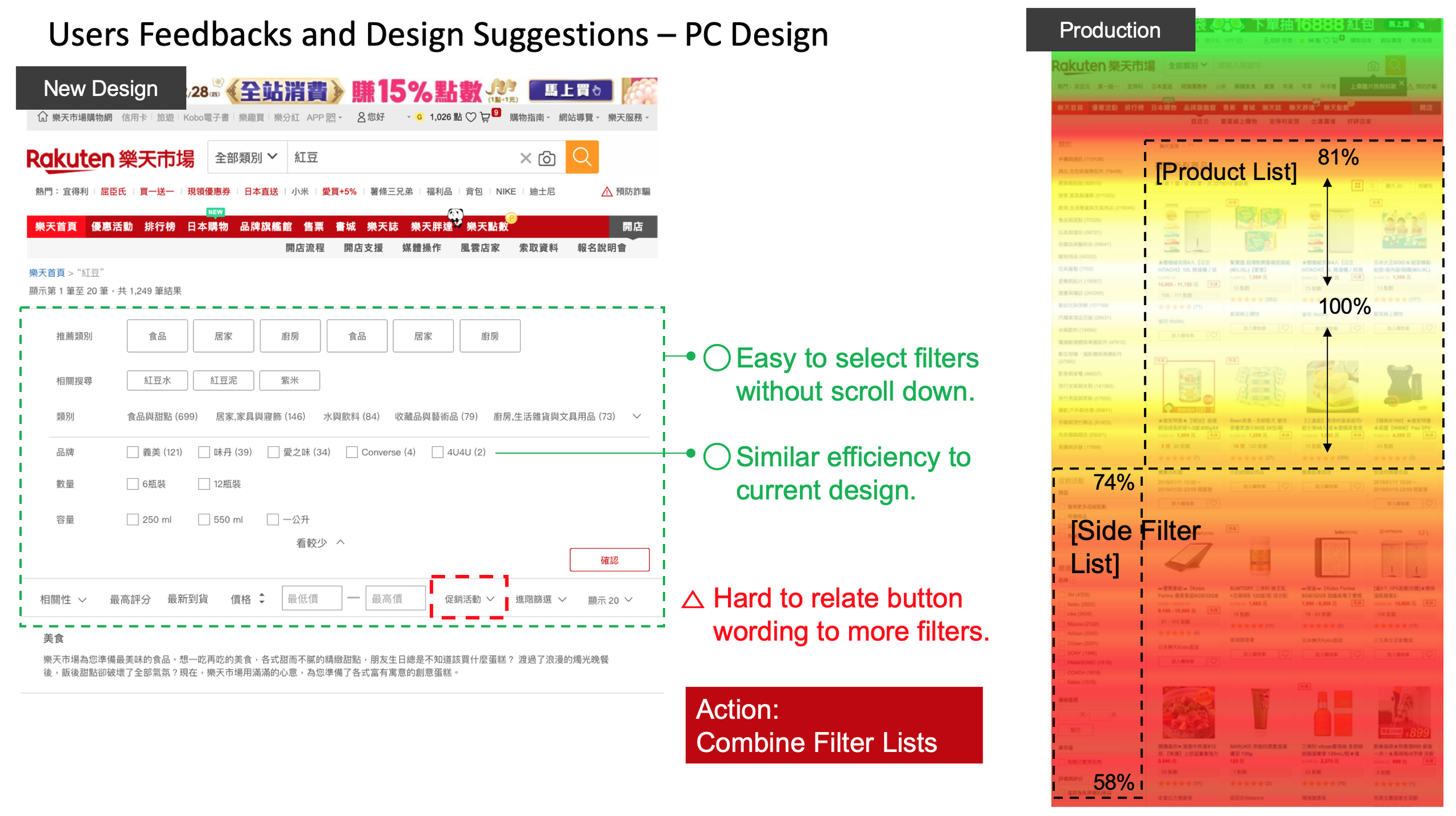
The usability testing result of new search design and the comparison with page popularity of production on desktop website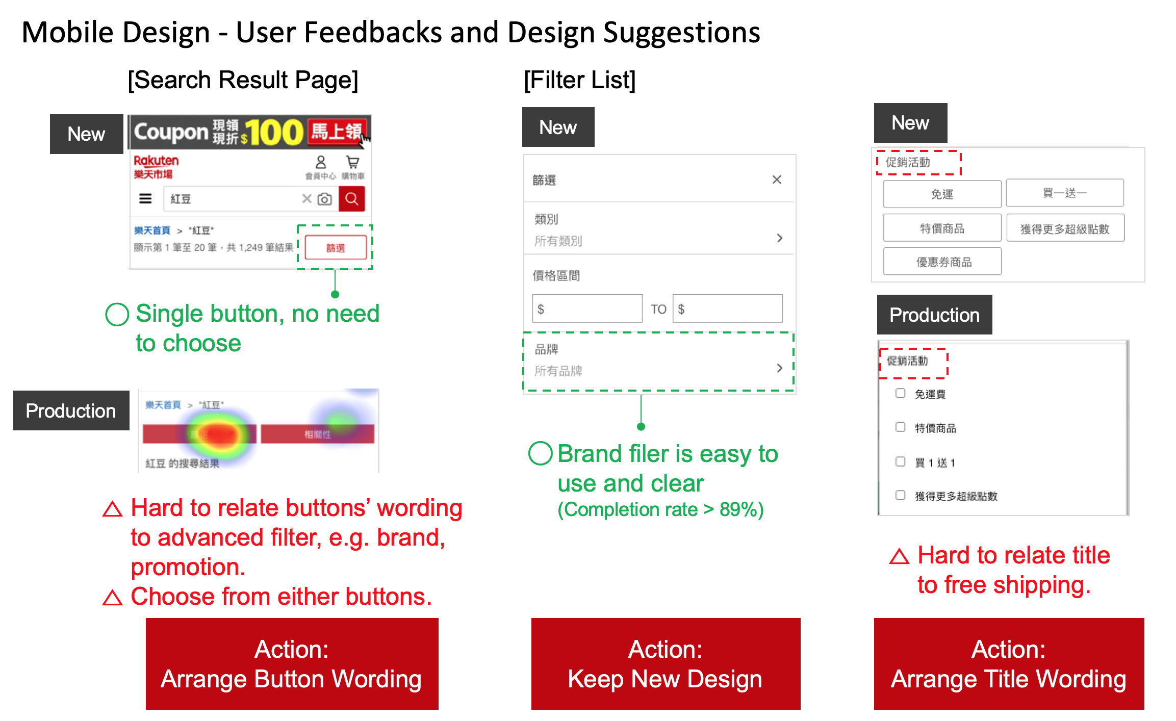
The usability testing comparison result of advance search function for production and new design on mobile websiteReform the E-commerce Search Experience
The results of prototype testing brought more confident on new design and also indicate the points need for design amendment before handover to UI designer and developers.
Scannable Product List on Users' Demand
Users scan through product list to check if these results matched what in their mind. And compare between products for a good deal. Depending on preference of recreation or goal-oriented search behavior.
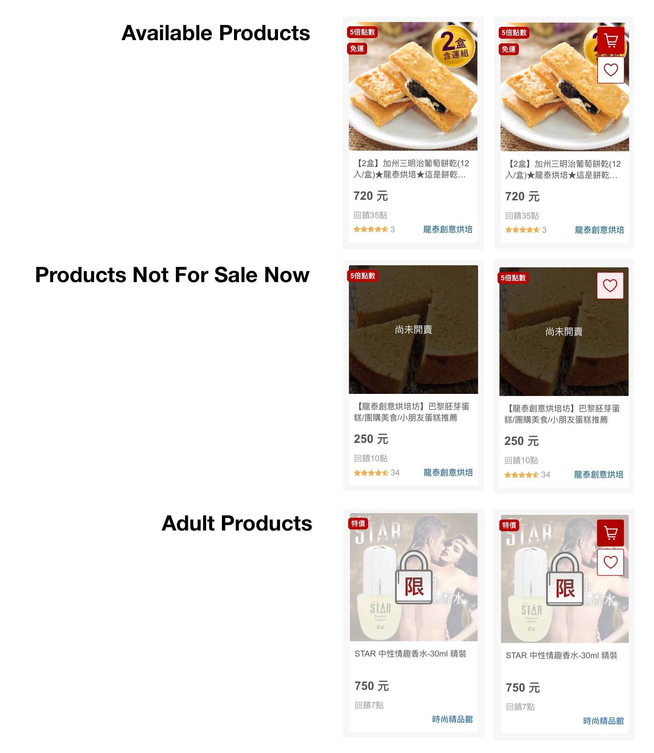
A variants of product cards show the different status of product and hover effect for desktop design Optimize Advanced Search Experience
Moving search filters to upper area and help users add advanced search filters easier and enlarge space for displaying product list.
Combine filters into one place.
No need to scroll downward for more filter options.
Help users screening for expecting results.
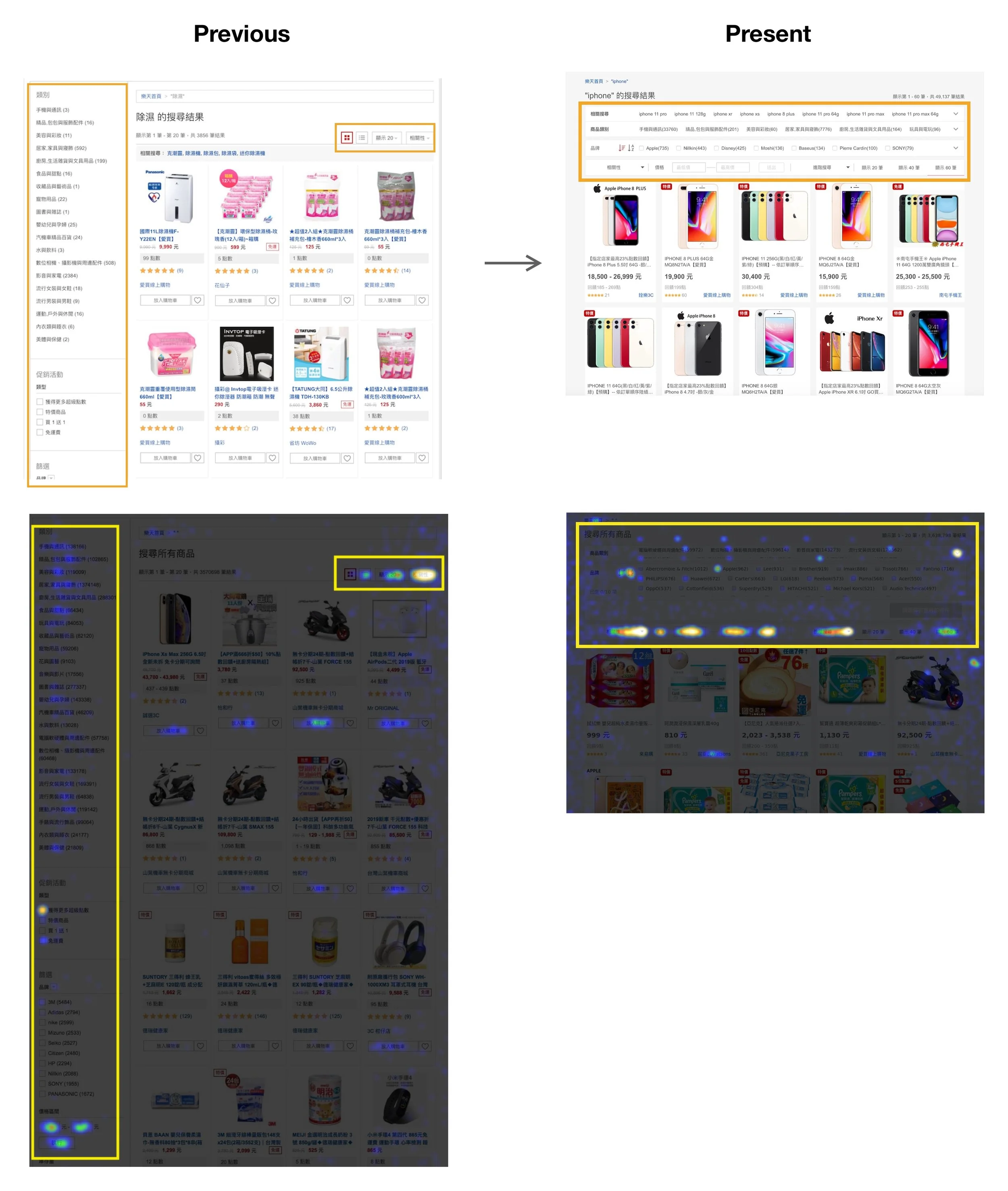
The A/B test result of live heatmap on original production page and new design pageInterested about this project?