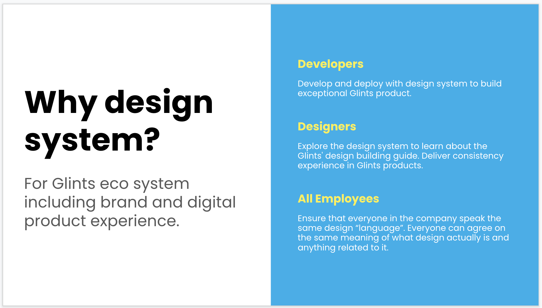
Design System
When I joined Glints, one of my mission was building the design system. This design system would applied on five product platforms to build synthesis Glints ecosystem. It also played as the single source of truth and aimed to increase 30% efficiency on designer's daily work. When product market extended, it would further applied on one more mobile OS. Along with the design system, there was an increasing need to convert design library into storybook for developers.
Problem Statement:
As a product designer, I need the guidelines and library to follow and build product experience in consistency.
As a developer, I need the guidelines and use cases to follow and implement the design delivery without ambiguity.
Responsibility:
I worked as the design leader for the design system building. I led seven product designers and partnered with one creative designer and two Share Service developers. The expected outcome were: design system website, design library and converted into storybook.
Presentation explained to company wide about the goal and purpose of building our own design systemBuilding the Design System
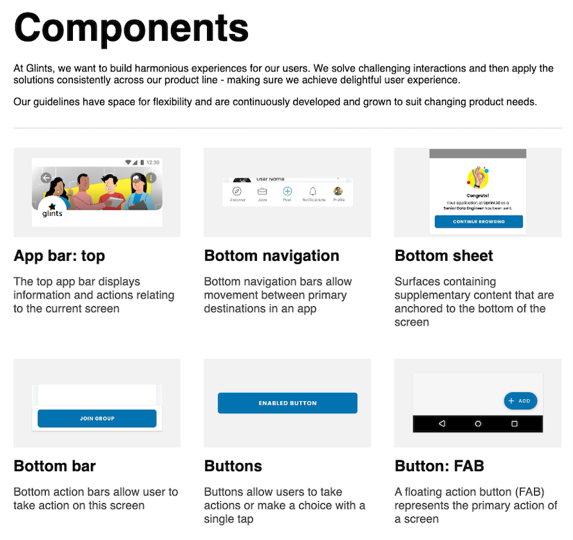
Spotlight 1Map UI components
Mapping existing UI components across three product platforms. As product market extended, the mapping became four platforms.
Mobile app
Candidate facing website
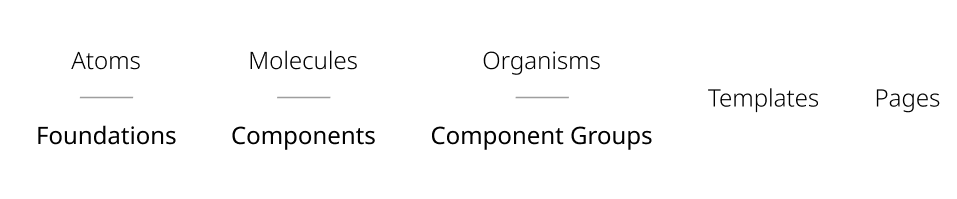
Employer facing websiteSpotlight 2Retitle atomic structure and component naming convention
These amendments came from the pain points of the target users - product designers and developers. First, the title of chemistry like atomic structure were not intuitive enough. The titles of structure made they think. Second, variety of component naming used by product designers and developers which increased communication effort. One component should be named the same along the product development process.
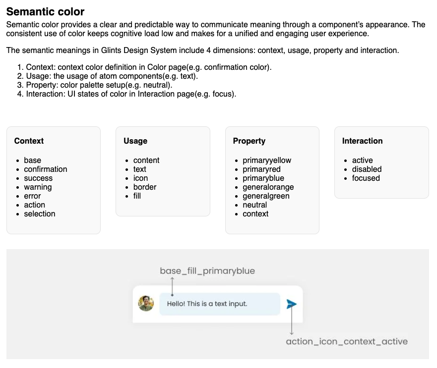
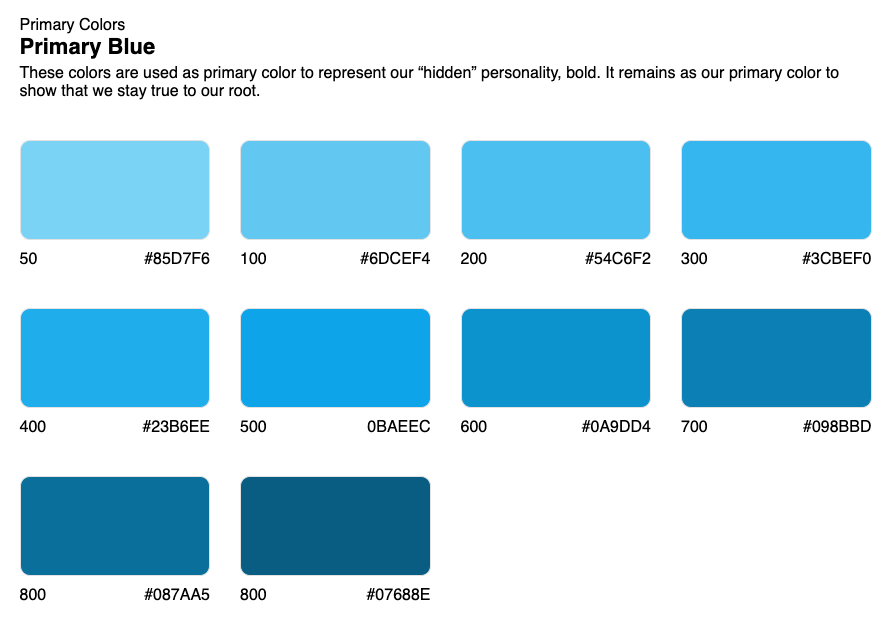
Spotlight 3Build semantic product color
Ensuring consistent color usage across platforms is a vital aspect of the product design process. We addressed this challenge by establishing a semantic color system, providing clear and intuitive color references for both product designers and developers.
Spotlight 4Replace secondary font
Considering the usage on the digital product, I made the decision to change our secondary font. Before this decision, our digital products inherited the font decided from former Creative Manager and this font does well on expressing our brand character and marketing usage. But when product market grow, we needed a reliable font which won't require customized in code and should include:
Language support (no-tofu characters)
Legible details
Multiple weights and styles
(Reference from Google Fonts)
After surveying on options for a reliable font and compared to each other, we decided our new secondary font. This new secondary font also works harmony with original primary font and won't break our brand character. The primary font uses on Heading, branding and campaign usage while secondary font uses on content-heavy digital products and can be more extendable for greater SEA market.

As Single Source of Truth
Once the key elements were created, I worked closely with creative designer and shared service developers to organize the implementation of design system website and convert into storybook upgrade.
Glints design system website 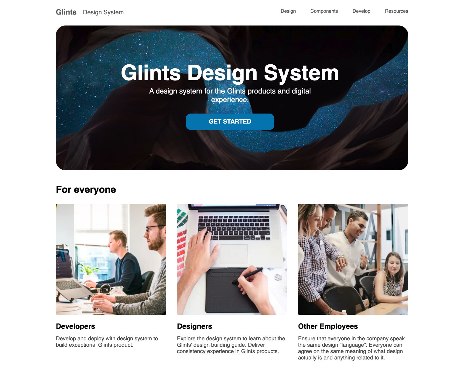

Interested about design system?